No one fancies the idea of feeling lost when they visit a website. Consider visiting a library to research wildlife, but the books aren’t structured accordingly. So, you painstakingly sieve through each shelf, looking for the book you need. Eventually, you’d get tired and give up on your quest. But most likely, you’d visit another library to find what you need.
It’s the same thing with websites. Without a website hierarchy, your visitors will be lost. In fact, nearly one in two visitors leave after landing on a cluttered website. Because, let’s face it, who would want to spend minutes searching for a particular content when millions of other websites are waiting to be explored.
Website hierarchy can be defined as the architectural structure of your website pages. You can easily see it reflected in how each part of the website is interlinked. The website hierarchy design aims to help visitors navigate seamlessly to different parts of your website.
It also helps search engine bots to crawl through and understand how different pages within the website connect.
This article explores everything about hierarchy web design, its importance, and how to structure one for your website.
How Does Website Hierarchy Work?
People who land on your website want to understand what it’s all about within the first 10 seconds. Thus, they’d look for the top-level navigation to identify different website sections and how to locate them.
If there isn’t any website menu for navigating between pages, the website will look unstructured to any visitor, and they might leave.
The website design hierarchy ensures visitors can locate different website sections without stress.
Types of Website Hierarchy
Hierarchy web design comes in two different types. These types are peculiar for various reasons and serve different purposes. They include:
● Flat site hierarchy website design.
● Deep site hierarchy website design.
We explore them below:
Flat Site Hierarchy
A flat site hierarchy website design is a hierarchical website structure in which different web pages are a click away from the main page. This hierarchy web design makes it easier for users to navigate different sections of the website.
Take the above website, for example. If someone wants to read more information about sci-fi books, they must click on the Books section at the top of the website. It will lead them directly to what they’re looking for.
It’s the same idea if they want to read up on Sci-fi TV shows, they’d click on the TV section. A flat site navigational hierarchy design ensures visitors get what they need within a few clicks.
Deep Site Hierarchy
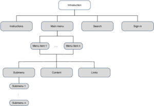
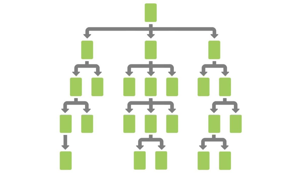
Deep site hierarchical website structure creates different website sections under various categories and topics. It is visually created using a triangle or tree setup. In this website design hierarchy, there are top-level navigation and sub-level categories.
Take a look at the example above. When you click on Lifestyle on The Washington Post, it reveals subsections such as Advice, Relationship, Travel, Fashion, and others. Thus, visitors who want to learn about lifestyle news will have to narrow their search into one of those subcategories to access different content.
While visitors might take a longer time to discover content, this website organization is beneficial for viewing content by categories and topics.
Why Hierarchy Is So Important in Web Design
Website hierarchy goes a long way to strengthen your digital marketing. How? We look at the reasons below:
Google Understands Your Site Better
Website hierarchy design gives Google’s bots an idea of what your website is about. Thus, they’d be able to crawl through and index your web pages seamlessly. Thus, when people search for content using targeted keywords, Google will be able to present your web pages to them.
Without a website design hierarchy, Google won’t be able to crawl through your site, risking visibility during organic searches.
Fosters Smooth User Experience
Website hierarchy ensures excellent user experience, as visitors will be able to locate the content they want to interact with. On the plus side, they’d spend more time on your website, increasing your website sessions.
When visitors spend more time on your website, Google sees it as good and will rank it above other web pages belonging to your competitors.
Prevents Your Website From Competing With Itself
If you have different content centered on the same topic, a hierarchical website structure will reveal to Google which page is the most important. Website hierarchy techniques such as interlinking and taxonomy prevent your web pages from competing against themselves.
Gets You Sitemaps Easily
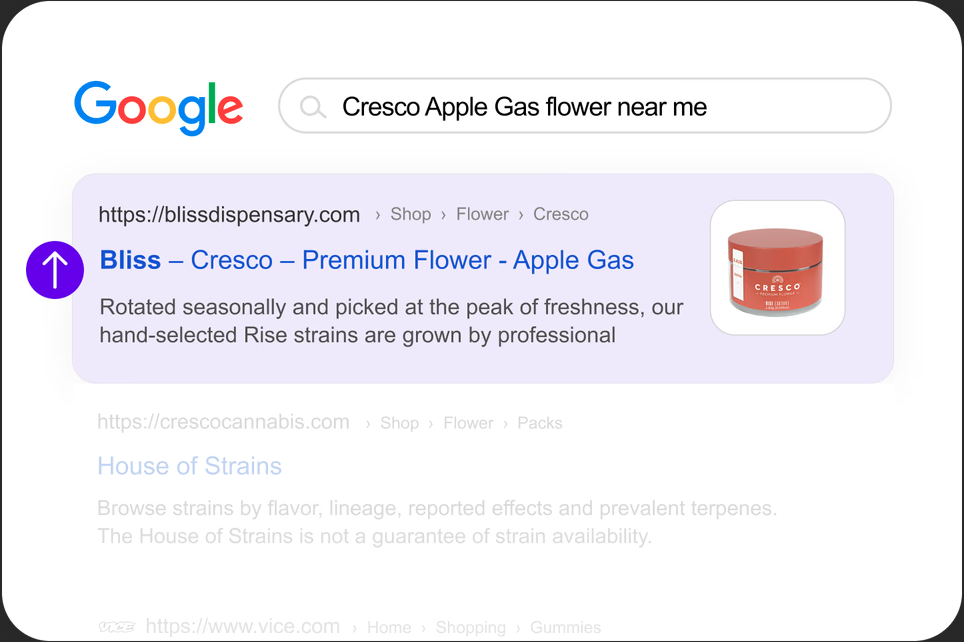
Sitemap levels on SERPs typically showcase your website’s most important pages. They are essential to getting you more clickthrough rates and improving your website rankings on SERPs.
What Elements Should Be Included in Site Hierarchy?
When incorporating website hierarchy design, there are essential elements to be added. These elements include the most important pages to increase web traffic and drive leads. These visual elements give users an idea of what your website is about.
For instance, if you’re running an eCommerce clothing website, the elements should include:
● Homepage
● Women’s clothing
● Kids clothing
● Men’s clothing
● Blog
● Contact us
See the example below:
If you’re running a website that offers services to people, the elements should include:
● Homepage
● Services 1
● Services 2
● Services 3
● Services 4
● Contact us
See example below:
These examples reveal different levels of website navigation, allowing visitors to locate content quickly.
How to Create a Website Hierarchy
To create a website menu for navigating between pages, you need to practice these tips:
Create a Simple Top-Level Navigation
On your homepage, you need to create a simple navigation menu. Too many top-level navigation menus might throw your visitors off.
You need to also provide genuine content based on the menu name. When users click on Blog on your website, they should be directed to the blog section containing your articles, not something else.
Add Sub-Menus to Your Site Hierarchy
In addition to the top-level navigation, you should create sub-menus if necessary. For instance, if you run an eCommerce clothing website, you can make sub-menus under top menus.
These sub-menus might include:
● Sweaters
● Sweatpants
● Sweatshirts
● Pants
● Polo shirts
● T-shirts
● Accessories, etc.
These sub-menus can fall under top menus like Men’s Clothing, Women’s Clothing, and Kids’ Clothing.
Keep Your URLs Simple
Creating user-friendly URLs for different parts of your website is essential. Content management systems like WordPress and CMS Hub automatically create a user-friendly URL based on the content title.
Your categories, directories, and sub-directories should have simple and user-friendly URLs. It should look like this:
example.com/blog/
Instead of example.com/default.aspx?lang=en&category=98a20
Keep Your Website Consistent
Your website navigational hierarchy should be consistent throughout the entire website. This includes the web design, link displays, and website theme.
When these visual designs are consistent, visitors might remain on the site longer, and that’s a good thing.
Use Breadcrumbs
Some of the best website navigation structures implement breadcrumbs to enhance their website architecture. Breadcrumbs reveal a current page all the way to the homepage.
Creating breadcrumbs for your website enhances its structure and appeal for your visitors.
Website Hierarchy Examples
Below are some of the common examples of website hierarchy designs:

Conclusion
Website hierarchy is an essential aspect of your digital marketing. With these tips and examples outlined, you can incorporate it on your website and thrive digitally.


